As a documentary photographer working primarily with film and traditional darkroom printing, I’ve always been fascinated by how different black and white film stocks can shape the narrative and emotional tone of an image. Unlike portraiture or fine art, where printing styles can be highly interpretive, documentary photography often calls for a more natural representation of the scene.
I think of learning to print as several levels of ability: beginner, competent, good, and exceptional. I’ve historically been quite consistent in my choices, mainly sticking to Kentmere 400 and Agfa APX400 for their reliability and balanced contrast (as well as lower cost). However, as an ambassador for Analogue Wonderland, I was getting more opportunities to experiment with a wider variety of film stocks. This has led me to discover some new favourites (Ferrania P33) and has inspired me to focus on black and white photography this year as I aim to take my darkroom printing from being “good” to “exceptional.”
In this post, I’ll share my experiences with different (mainly 35mm) films and how they differ within my own approach to printing.
One of the terms I will use a lot with each film is referring to the film’s contrast grade, so to help with the context, here is a brief introduction to Contrast Filtration.
Understanding Contrast Filtration in the Darkroom
When printing black and white negatives, contrast filters help control the tonal range, allowing for more precise storytelling through shadows, midtones, and highlights. This is especially useful in documentary photography, where capturing the full spectrum of tones can enhance the context and emotional depth of an image.
Contrast filters typically range from 0 to 5:
0 (yellow) – Lowest contrast, expanding midtones and softening shadows and highlights. Useful for balancing harsh lighting or overly contrasty negatives.
2 (no filter) – Considered to be “normal” contrast, balancing shadows, midtones, and highlights naturally.
5 (magenta) – Maximum contrast, producing deep blacks and bright whites with minimal midtone detail. Ideal for bold, graphic images.
These can be combined through a very useful technique called Split Grade Printing, where you expose with both 0 and 5 filters allowing you to have the best of both worlds—subtle tonal gradation and bold contrasts.
Paper Stocks
Different paper brands each have their own unique characteristics, influencing the final look of a print. Glossy papers typically offer higher contrast and deeper blacks, making them ideal for bold, high-impact images, while matte papers provide softer shadows and a more subtle tonal range, lending a delicate, understated quality to prints. Additionally, paper tones play a significant role: cool-tone papers enhance blues and neutral grays, perfect for dramatic, moody scenes; neutral-tone papers provide a balanced, classic look suitable for a wide range of subjects; and warm-tone papers bring a slight sepia warmth, adding a nostalgic or intimate feel.
I generally prefer Ilford papers in a gloss finish, as they consistently deliver the contrast and depth I look for in my prints. However, I sometimes use Foma papers for their unique tonal qualities and distinctive character, offering an alternative look when I want to experiment or achieve a different mood.
The choice between resin-coated (RC) and fibre-based (FB) papers further affects the final result. RC papers are easier and faster to process, with a consistent finish and sharp detail, making them a practical choice for proofing or high-contrast prints. In contrast, FB papers offer superior tonal depth and archival longevity (at a much bigger price point), with a more textured, tactile surface that enhances the tactile quality of a print. They require more careful processing but reward the effort with rich, nuanced tonal gradations.
These characteristics can be further expanded through the use of toners, which adjust tones and enhance print longevity. With so many variables to control and experiment with, what I love about the darkroom is the ability to extend the physical nature of shooting film into the printing process, embracing all these creative variations to bring each image to life.
So now onto the films!
All of these examples are shown on Ilford MCiv RC paper (Gloss Finish)
Kentmere Pan 100 & 400: Balanced and Versatile for Realistic Tones
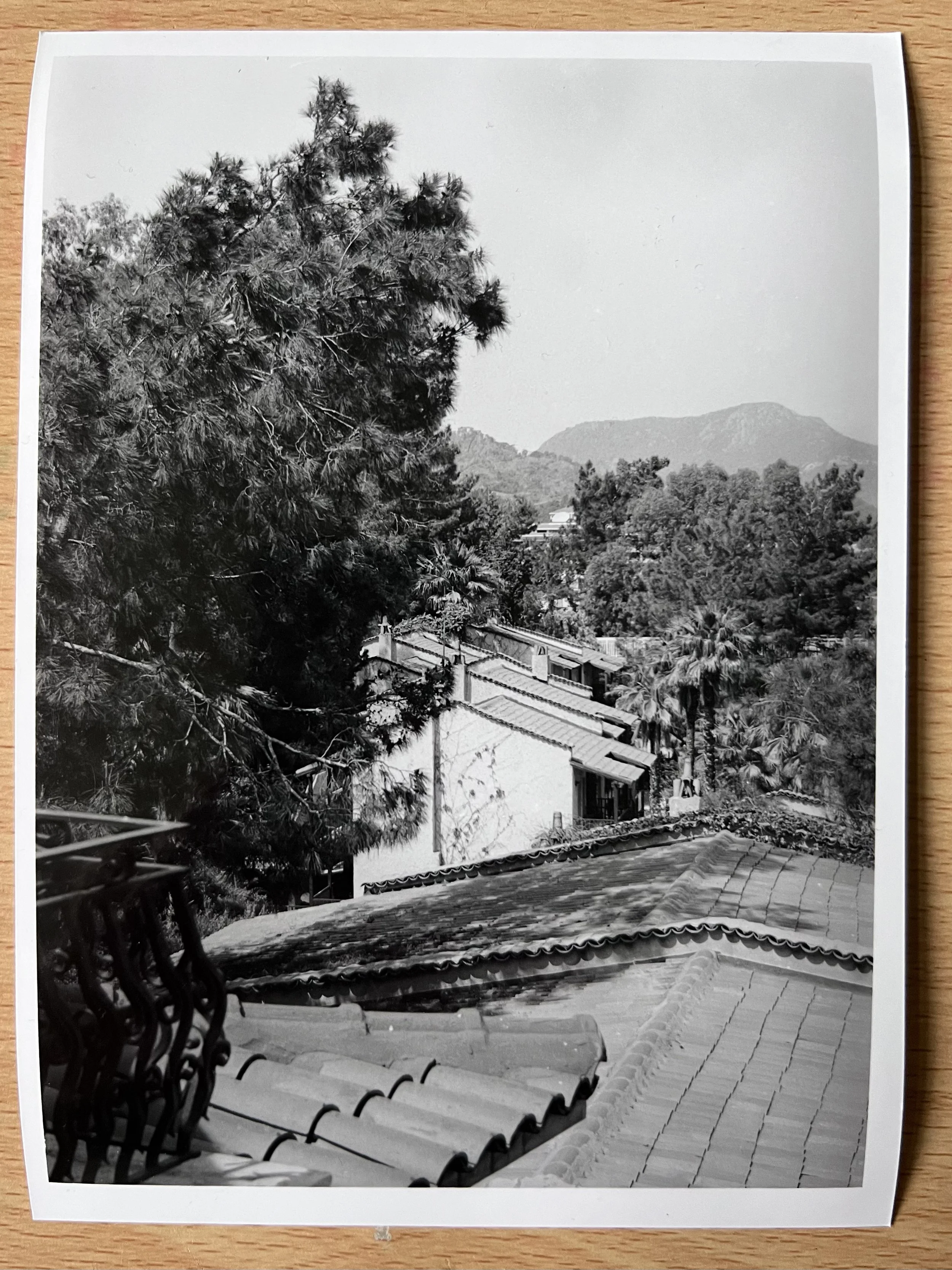
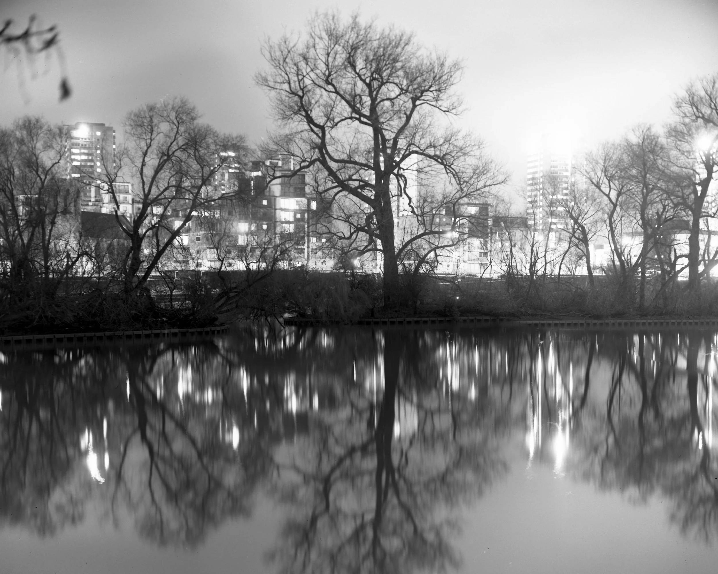
Kentmere Pan 400 (and 100 for sunnier climates) is my go-to film for general-purpose work. It offers a (blue)dense base compared to a lot of other films that enhances midtones and shadows, making it great for street scenes or urban environments. However, it tends to lose some detail in the highlights.
In the darkroom, I typically start with a grade 3.5 or 4 filter to boost contrast while preserving the film’s natural tonality. This combination deepens shadows and adds punch to midtones, helping maintain realism without exaggerating the scene’s atmosphere. This balanced contrast is particularly effective in conveying texture and detail, which is essential for storytelling in documentary photography.
Kentmere 100
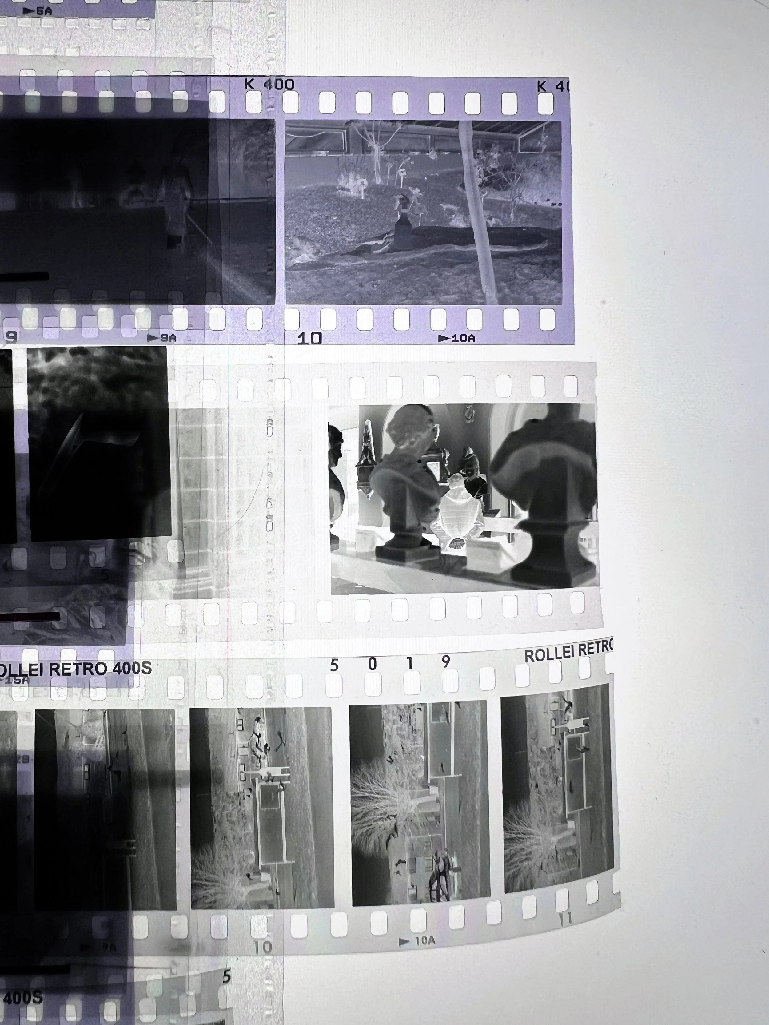
Another filmstock that has a dark base giving strong midtones is Rollei RPX400
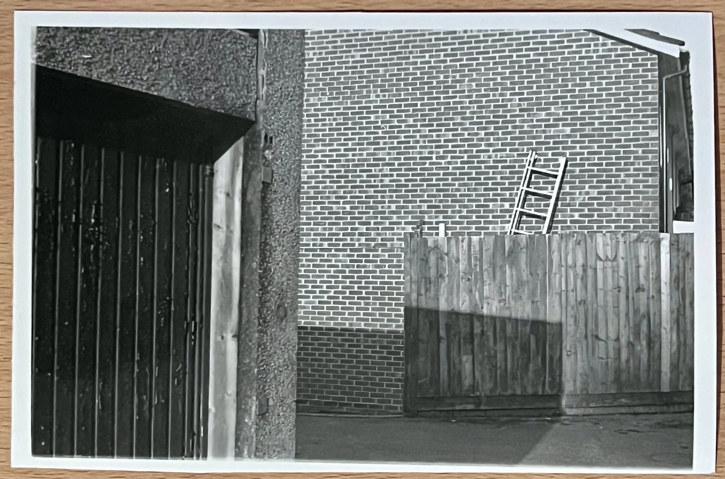
Lucky SHD400: High Contrast for Bold Storytelling
For scenes that require a more dramatic or high-contrast look, I recently experimented with Lucky SHD400. Its clear base layer produces tighter blacks and whites, creating a punchy, bold appearance that works well in dynamic or high-emotion scenes. However, the trade-off is less subtlety in the midtones, which can appear compressed.
To balance this inherent contrast while preserving some tonal depth, I use a filter grade of 2.5, this gives a similar level of contrast to kentmere with a filter 3.5 This approach works particularly well in fast-paced environments like street photography, where strong contrasts can enhance the sense of movement and emotion. This is a film that has a lot to offer, but after one roll, I am still finding the right direction with it in the darkroom.
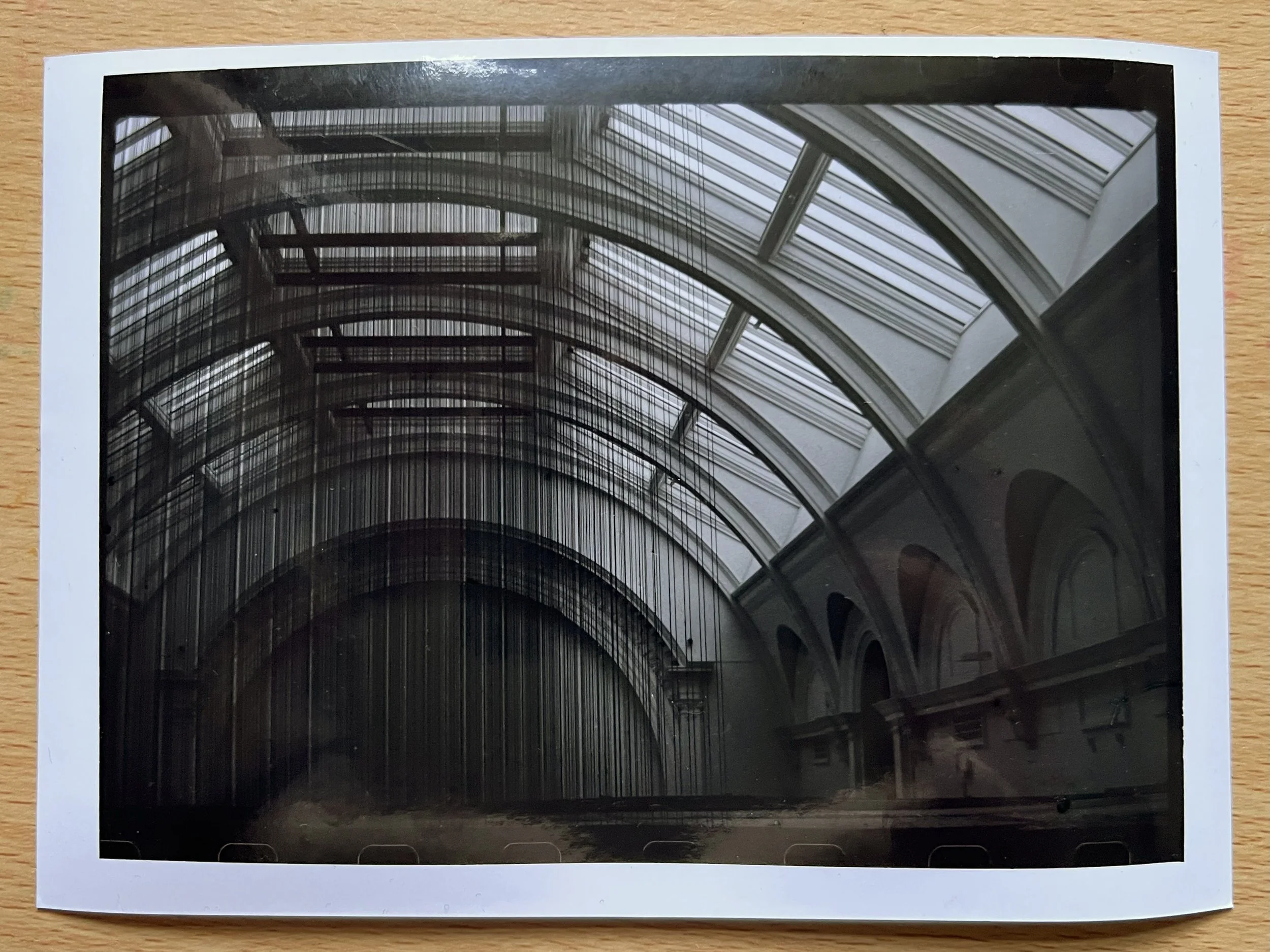
Lucky SHD400
Agfa APX400 and Rollei Retro 400: Rich Contrast with a Dark Base
Agfa APX400 and Rollei Retro 400 share a history with Rollei (apparently) taking the emulsion recipe from Agfa when they went bankrupt in the mid-2000s and are therefore remarkably similar to print with. Both films deliver higher contrast, making them ideal for scenes with dramatic lighting or bold graphic elements. This characteristic suits my documentary approach, where deep blacks and pronounced shadows can enhance atmosphere and storytelling.
I find these films particularly effective in urban environments and high-contrast situations, as they provide rich shadows and bright highlights without sacrificing midtone detail. Starting with a grade 3 filter usually achieves a balanced contrast, but for more dramatic results, I occasionally increase to grade 4. Their consistent performance allows me to maintain a cohesive visual style across different projects.
The shared heritage of Agfa and Rollei translates to similar tonal qualities and contrast behaviour, making them reliable choices when I want impactful, high-contrast images.
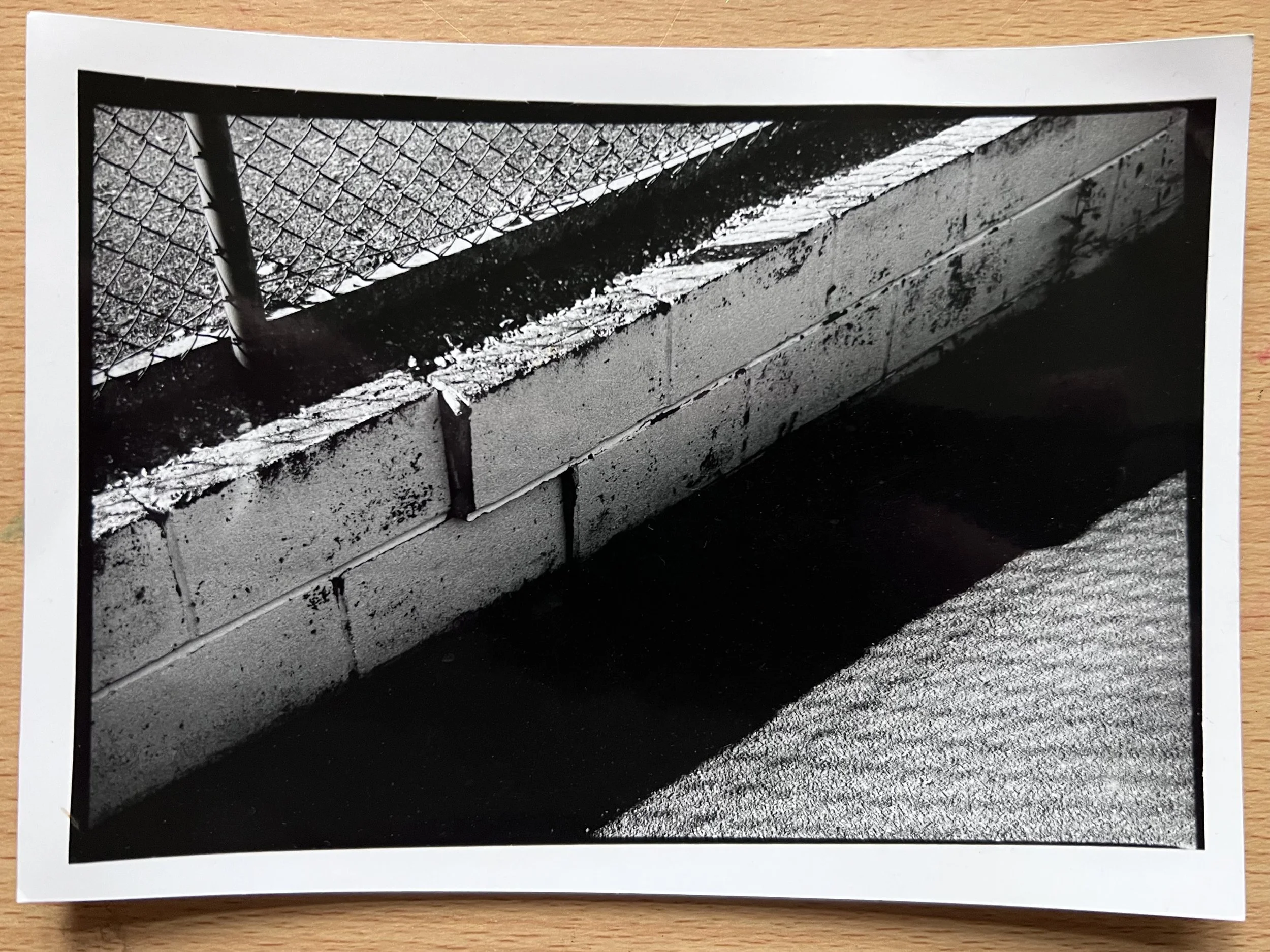
Agfa APX400
Ilford: Midtone Richness with a Softer Shadow Profile
Ilford HP5, FP4, and Pan F are renowned for their rich midtones and smooth tonal transitions. This makes them excellent choices for subjects requiring subtle gradation, such as environmental portraits or atmospheric landscapes. However, in my experience, they lack the crisp shadow areas that I often like. This is from a subtle grey base compared to Agfa, Rollei or Lucky & can lead to softer, less defined shadows; which doesn’t always compliment my work.
Despite this, Ilford FP4 is one of my favorite film stocks for large format photography. The larger negative size enhances the film’s exceptional midtone richness and tonal depth, creating stunningly detailed prints with a more nuanced contrast. It’s in these larger formats that Ilford’s subtlety truly shines, delivering a delicacy and texture that few other films can match.
Ilford FP4+ (f/5.6, 5 min)
I’m also interested in exploring Ilford Pan F more, particularly for portraiture. It's fine grain and exceptional midtone detail suggest it could bring a unique softness and depth to portraits.
It is also worth mentioning Ilford XP2, this C41 Black and white film has a very purple base layer; purple is close to magenta in colour and therefore this film naturally has much higher contrast than other Ilford films.
Ferrania P33: My New favourite film
One of my recent discoveries through Analogue Wonderland is Ferrania P33, which combines a clear base layer with fine grain and excellent mid-tone reproduction. This makes it particularly useful for portraiture and architectural details. You can see my initial review of the film in this blog article from last year.
I’ve been printing Ferrania P33 at filter grade 3 for balanced contrast and rich tonal gradation. I sometimes push it to grade 4. This flexibility allows me to adapt the prints to the narrative needs of each project without losing midtone detail.
Ferrania P33
Conclusion:
For me, darkroom printing is more than just a technical process - it’s a way to shape the narrative. By understanding the characteristics of different film stocks and mastering contrast filtration, I can better convey the story behind each image.
From the bold contrasts of Lucky 400 to the fine-grained subtlety of Ferrania P33, each film stock brings its own voice to the narrative. Experimenting with these nuances in the darkroom is as fun a part of the process as the time spent behind the camera.
If you’re exploring darkroom printing for the first time or after years of practice, I encourage you to experiment with different films and contrast filters, try split grade printing. It’s not just about getting the right exposure - it’s about finding the tonal language that best conveys your story. As Ansel Adams once said; “The negative is the equivalent of the composer's score, and the print the performance.”